Context
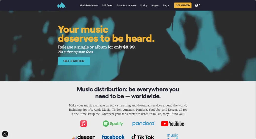
CD Baby gets independent artists' music onto every streaming platform.
Signing up and starting a release is free. Artists pay a one-time fee to finalize and distribute it.
Diagnosis
Right after signup, we asked for an SSN and bank account.
The signup flow dropped new users on Payment & Tax Info. Talking with our Support team backed up the hunch.
We were asking for high-trust information before new users had seen any value.
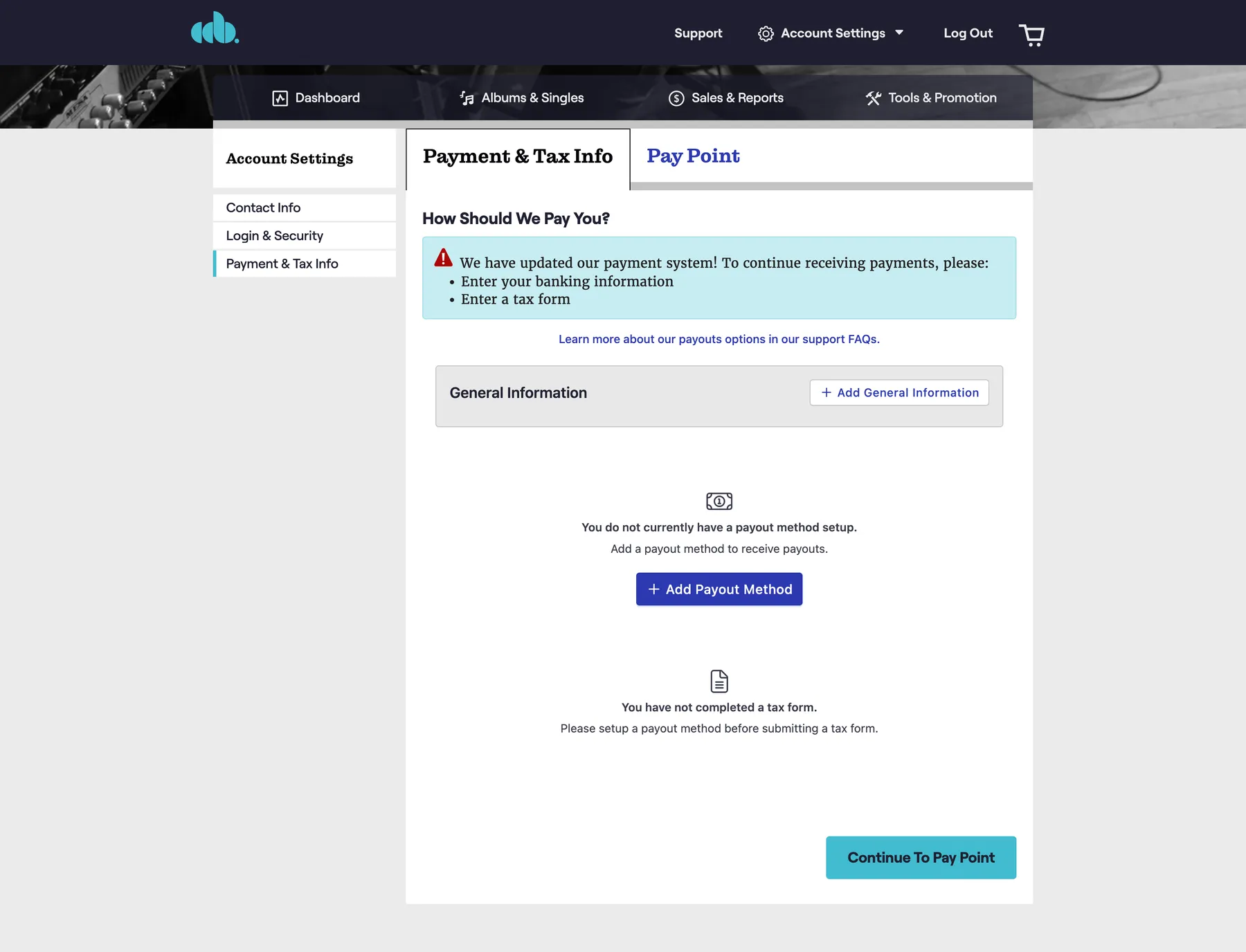
- Bank details before the user has done anything
- Tax form with sensitive personal information
Options
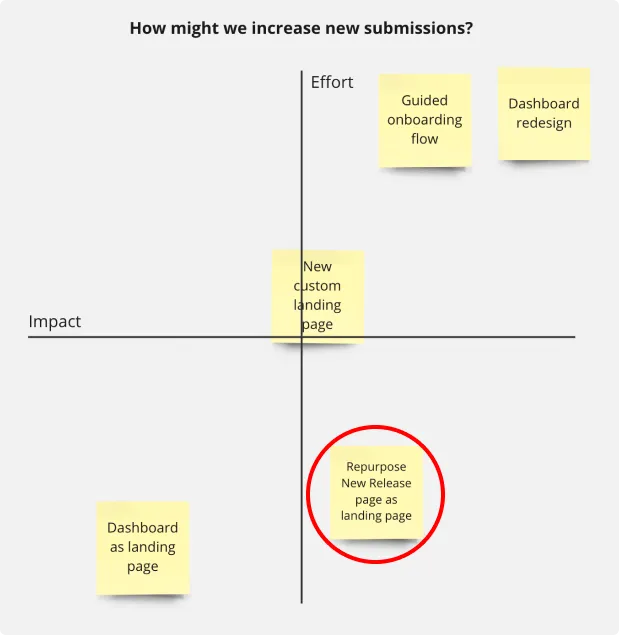
We mapped ideas by impact and effort, then picked the cheapest big win.
I brainstormed with design and PM peers. Repurposing the existing New Release page as the landing page was low effort and high impact.
Solution
Same page, two tweaks: the New User Submission Prompt.
The page's main action, starting a single or album, was already exactly what new users needed.
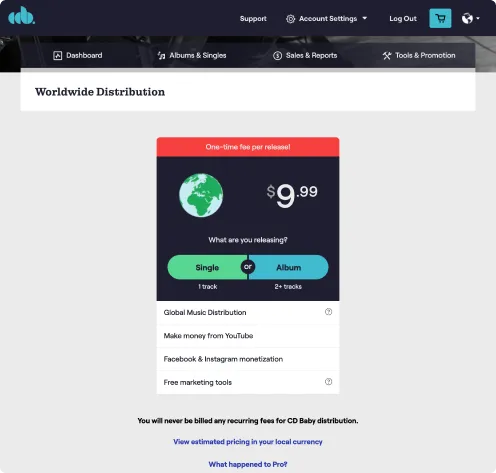
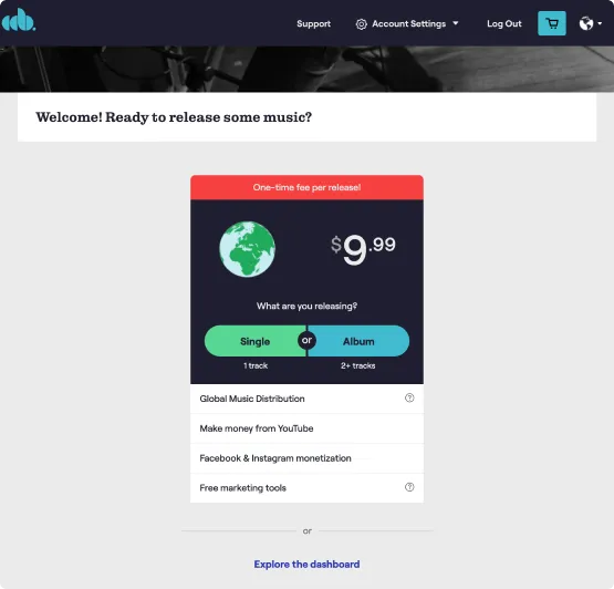
- A welcoming headline for first-time users
- An escape hatch to the dashboard for people who just want to look around